Brand Portal · v1.0 · 2026
The visual identity
The visual identity
of Lingo4all.
This is the official Lingo4all brand portal — a living reference for logos, colors, typography, iconography, applications and visual standards. Built to guarantee consistency, clarity and care across every portal, every surface, every language.
15+
Portals in the ecosystem
3
Core brand colors
7
Inter weights
Official logotype
Version
Master
Background
Light
Format
PNG
01 · Manifesto
A brand is not decoration.
A brand is not decoration.
It is discipline.
Lingo4all lives at the intersection of language, learning and human connection. Every element of this identity exists to deliver that promise on any surface: from a teacher's screen in São Paulo to a student's phone in Mexico City.
Conversation
Language is a dialogue. The brand always speaks with warmth, never down at the user.
Just a click away
Our tagline is a promise: friction-free access to the right teacher, in the right language, right now.
Global, by design
Every visual decision must work in English, Portuguese, Spanish and beyond — typographically and culturally.
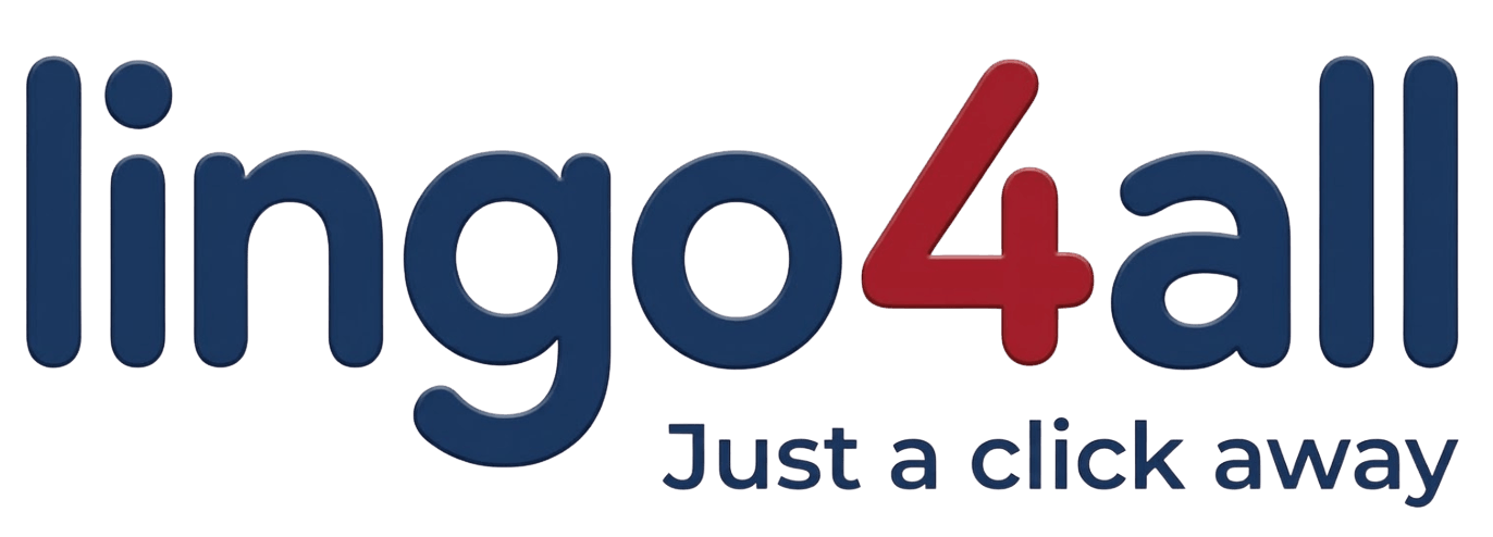
The logo system.
The Lingo4all brand operates around a single official master logo — the lowercase "lingo4all" wordmark in navy with the "4" highlighted in brand red and the "Just a click away" tagline. It scales cleanly from a 16-pixel favicon to an outdoor banner.
Primary version
Official master logo
PNG · transparent
This is the canonical Lingo4all logo: the full word "lingo4all" set in deep navy with the numeral "4" emphasized in brand red, paired with the "Just a click away" tagline. Use this version whenever the context permits — websites, contracts, decks, signatures, social, print.
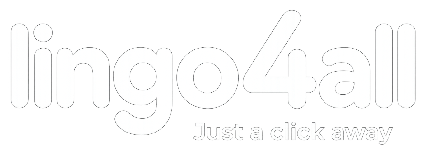
Inverted version
Master logo · white
PNG · outline
Use over the brand navy or any sufficiently dark photographic / colored background where the standard navy+red version would lose contrast.
Simple version
Wordmark · "lingo4all"
PNG · 1545×477
A condensed lowercase mark used in tight digital UI, email signatures, app icons and anywhere the full master logo would not read clearly.
A version for every background.
A set of approved color treatments and portal-specific tinted variants cover every context we ship into. Always pick the version that keeps the highest possible contrast against the background, without competing with surrounding elements.
Master logo · color treatments
Portal-specific lockups
Student lockup
student.lingo4all.com
Recruiter lockup
recruiter.lingo4all.com
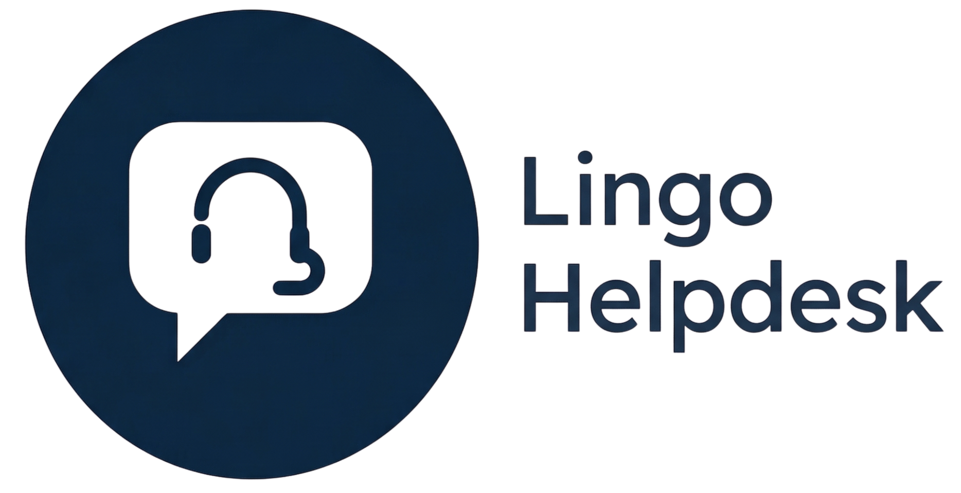
Helpdesk lockup
desk.lingo4all.com
Universal · white
on any portal in dark mode
Give the mark room to breathe.
Minimum clearspace
Keep at least the equivalent of the cap-height of the "L" in LINGO as free margin on every side of the logo. No graphic element, text, photographic ornament or visual noise should enter that zone.
Minimum size · digital
20px ↑
48px ↑
Below these sizes, switch to the favicon set.
Minimum size · print
- Business card 20 mm
- A4 stationery 35 mm
- Banner / outdoor 120 mm +
What you must never do.
Brand consistency depends on respecting boundaries. These are the main behaviors to avoid when working with the Lingo4all logo on any surface.
Never
Do not distort the logo's proportions — keep the original aspect ratio.
Never
Do not recolor the logo outside the approved palette.
Never
Do not place over low-contrast or visually clashing backgrounds.
Never
Do not rotate, mirror or apply skew / tilt effects.
Never
Do not apply drop shadows, blur, gradients or filter effects.
+ another logo
Never
Do not lock up with other logos without the official clearspace and brand-team approval.
The official Lingo4all colors.
The color system is built around three brand pillars — Navy (authority, trust), Red (energy, attention) and Green (growth, language). Complementary blue and a disciplined neutral scale support every UI surface across the ecosystem. Click any chip to copy the HEX.
Brand colors
Support colors
Neutral scale
Official gradients
Lingo Spectrum
120deg, Blue → Red → Green
Navy Gradient
180deg, Deep Navy → Panel
Semantic colors
Inter, everywhere.
Inter is the only official type family across the Lingo4all ecosystem — a geometric, neutral, highly legible sans-serif designed for screens. Use JetBrains Mono only for code, technical numbers and short captions where a monospaced rhythm helps reading.
Language for everyone, anywhere.
Language for everyone, anywhere.
Language for everyone, anywhere.
Language for everyone, anywhere.
Language for everyone, anywhere.
Language for everyone, anywhere.
Language for everyone, anywhere.
Text hierarchy
Display
Heroes, section openings, deck covers.
Section
Block titles, slide headlines.
Subtitle
Sub-blocks, highlighted cards.
Paragraph. The quick brown fox jumps over the lazy dog —
used to verify that every weight of Inter renders cleanly on the target surface.
Eyebrow / label
Section eyebrows, micro-copy, tags.
One brand, every portal tab.
Each portal in the Lingo4all ecosystem ships with its own dedicated favicon so users can distinguish open tabs at a glance. The universal favicon (two chat bubbles) is the default for any public-facing surface; portal-specific favicons are used inside the authenticated experience.
Implementation tip: always serve the favicon
at multiple sizes (16, 32, 48, 192, 512) and reference both
.png
and .ico in the
<head> for full browser coverage.
One brand, fifteen surfaces.
Lingo4all is not a single product — it's a network of specialized portals serving teachers, students, recruiters, partners, franchisees and the operations team. Each one inherits the same master logo, the same Inter typeface and the same neutral grammar — but is tinted with a dedicated accent color so the user always knows where they are.
A measurable system.
Spacing scale (Tailwind compatible)
0.25
4px · space-1
0.5
8px · space-2
1
16px · space-4
1.5
24px · space-6
2
32px · space-8
3
48px · space-12
4
64px · space-16
6
96px · space-24
Border radius
sm · 6px
md · 10px
lg · 14px
full
Shadows
sm
md
lg
Layout grid
12 cols · base
gap-4 · 16px gutters
1400px · max-width
Mini design system.
The visual building blocks that compose every Lingo4all interface — the foundation for websites, dashboards, contracts and partner decks.
Buttons
Inputs
Active students
765
+ 28%
Let's talk
Start your Lingo4all journey.
The brand in motion.
How the Lingo4all identity comes alive across different surfaces — from the institutional website to the franchise partner deck.
Institutional website
Language is human.
Connection is global.
Connection is global.
Just a click away from a teacher who speaks your goal.
Find a teacher
Become a tutor
Email signature
L4
Name Surname
Role · Lingo4all
📧 name@lingo4all.com
🌐 lingo4all.com
💬 Just a click away
Instagram post
Insight · 04
A language without a teacher is just noise.
@lingo4all · lingo4all.com
Business card
lingo4all.com
Name Surname
Role · Lingo4all
+1 (555) 010-2026
name@lingo4all.com
Front: navy · back: white · 85 × 55 mm standard.
Document cover
Franchise proposal
Language, licensed.
v1.0 · 2026 · Confidential
Teacher dashboard
Overview
Last 30 days
Classes
182
Hours
94 h
Rating
4.9
Official brand kit.
All files available for direct download. Always use the official versions — do not recreate or re-edit the artwork.
File
Format
Size
Need a version in another format (SVG, AI, EPS) or a specific application? Email the brand team at brand@lingo4all.com.
Brand Portal · Lingo4all
A brand cared for.
A brand cared for.
A promise amplified.
This portal is maintained by the Lingo4all brand team. Questions, requests for new formats or partner approvals for use of the brand: get in touch.